 Using high-quality images on your website, social media channels, and blog posts not only makes your brand more appealing—it also drastically improves conversion rates. In general, humans are visually focused, and much more likely to read and remember an article with compelling visual accompaniment than one with a huge block of text.
But here’s the catch: decent stock images can be costly, and while some businesses have the luxury of being able to afford a graphic designer, it’s not an option for everyone.
Below, I’ll cover how to source and alter your own custom images, as well as how long you should spend on them, and the occasions where splashing out on a designer is worth it.
Source stock images that aren’t terrible
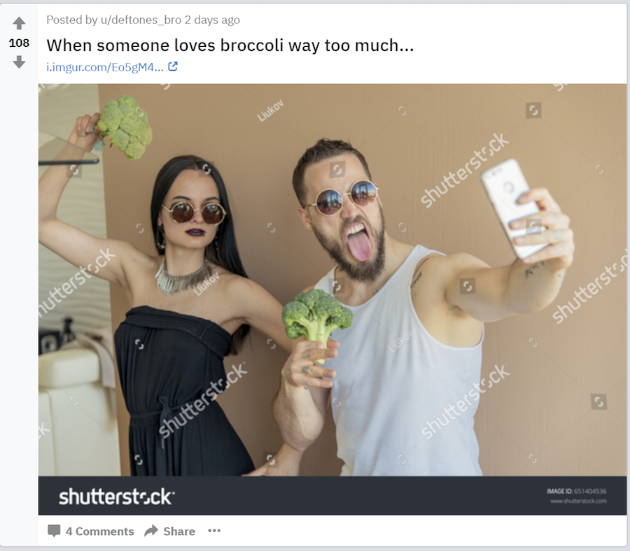
Terrible stock photos are rife on the internet. In fact, there is even a subreddit for this stuff:

So, what makes some stock photos so terrible? Namely:
- Irrelevance
- Poor taste
- Over-the-top studio lighting
- Scenarios that have no relation to the real world
- Implausible models and events
- Poor aesthetics
- Artificial poses and props
Bad stock photos tend to look and feel artificial, and they don’t resemble anything you would see in real life. The classic stock photo fare includes women and men randomly smiling and pointing at things in generic office settings.
Finding good stock photography and imagery for your business
Having said that, not all stock photo imagery is bad. In fact, there are plenty of ways that stock photos can be used as part of visual storytelling campaigns.
When used appropriately, free stock photos are an effective way to bring your content to life. A beautiful image has the power to hold attention and significantly improve engagement; Facebook posts with images see 2.3 times more engagement than those without. If you’re like me, you’re always on the hunt for free or inexpensive stock photo websites with authentic, original imagery.
The main problem with a lot of stock photos is that they’re not authentic or original—far from it. The web is saturated with business and lifestyle clichés, from “smiling woman wearing headset” to “suits gathered in the boardroom.”
Luckily, there are some websites that do better. My favorites for high-quality free stock photos are Burst and Unsplash. They both have images that break away from the dreary norm.
If you produce a lot of content for your blog and social media channels, finding new and interesting images to use on a regular basis can be challenging. Especially if you’re trying to illustrate something conceptual, like teamwork or growth.
In these instances, you have to be prepared to think creatively when searching for images—perhaps using word association or metaphorical representations.
Some image search ideas for content about teams and teamwork:
- Team sports
- Nature
- Hands
- The globe (if global)
- Cables (networks)
- Animals (herds)
- Bees/ants
Some image search ideas for growth:
- Plants
- Children
- Sunlight
- Roads
A good way to start your image search is to use seed keywords, then explore at related searches and categories. Most photo sites have very good suggestions that will highlight related and similar images.
Here are some tips for choosing non-terrible stock images:
- Look for authentic, real-world scenarios—avoid white backgrounds
- Opt for those where the subjects look natural, not posed
- Look for fresh, new photos that are interesting but avoid cliches
Improving stock images through customization
Next, you’ll want to alter your images to customize them for your website. And if you don’t want them looking terrible, that means having a general knowledge of best practices for font size and readability, and how monitors can display colors differently.
First things first, make sure that your on-screen colors are consistent by carrying out a basic monitor calibration. Here’s how to do that.
A lot of people choose to use Canva to customize images, and if you’re not a designer, it’s a great way to go. Canva is a free graphic design tool that uses a simple drag-and-drop format, as well as providing access to a range of photographs, graphics, and fonts. Probably the best thing about Canva is the fact that you can use their templates as a base and import your own imagery. This allows for a high level of customization.
Here are some good rules of thumb that most graphic design experts will stand by:
- Don’t use too many different fonts, and try to think carefully about how you match fonts. You may want to stick to fonts from the same families in certain cases (known as typecases—Helvetica and Lucida are examples of a typeface).
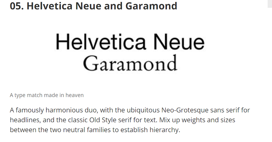
- Pair contrasting typefaces for maximum visual effect. Creative Bloq list 20 pairings, like this classic Helvetica Neue and Garamon duo:

- Up the contrast by adjusting the brightness of your background—this will make the text clearer and easier to read
- If in doubt, keep it simple. Every element should justify its presence in the design
- Ensure that the most important part of your message is the most visually dominant
- Avoid following trends and stick to designs that are in line with your brand’s style
Using tools like Canva, you can create perfectly nice, serviceable images. But remember, this is really for the everyday stuff—a blog or social media post. If you’re after something exceptional—something that you’ll keep on your homepage for a year, then you must be prepared to pay for it.
Graphic designers understand what an online tool doesn’t—how to use design to influence emotions and motivate action. If you don’t have a graphic designer in-house, consider hiring one using a service like People Per Hour.
How much time should you spend on images?
Creating custom images can become a real time drain if you’re doing it every other day—and it can be expensive if you’re outsourcing it to a designer. You want to get it right so your images look as appealing as possible, but at the same time, you have to strike a balance when it comes to how long you spend per image.
Using Canva, you can theoretically create images in a matter of minutes—unless you spend hours faffing with them and experimenting with different variations.
How long you spend should depend on how much value you’re likely to get from the image. If you’ve spent a lot of time—several hours, perhaps—on an interesting and compelling image, it’s an absolute waste if you only intend to use it once on social media.
But if you can also include it a few other places in an article, an email blast, or elsewhere on your website, you’ll get a much better return on your investment. Even with all the time and resources in the world, single-use graphics are rarely worth the effort.
Images have the power to improve your visitors’ experience and extend the amount of time they spend engaging with your content. To create your own custom images, find the best free images at your disposal and edit them wisely—within a reasonable time limit. And, if it’s something important that you’ll use again and again, consider getting a professional designer on the job.
from Bplans Articles https://ift.tt/2leV5ML
No comments:
Post a Comment